MICHANG

 > PR > CI
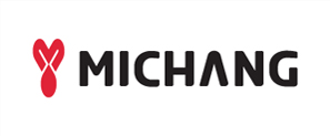
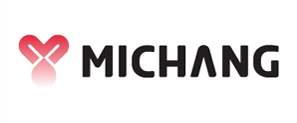
Symbol Mark
The initial of the company, M, represents the shape of heart to symbolize love.
The symmetric design signifies equality and cooperation between people, between company and society, and between company and customers. This symbol can be used for all visual materials as corporate symbol.
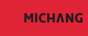
Colour System
Main Colour
C 7% M 100% Y 83% K 0%
R 235% G 0% B 40%
Type Colour
C 0% M 0% Y 0% K 70%
R 109% G 110% B 113%
Sub Colour
C 0% M 70% Y 85% K 0%
R 255% G 102% B 27%
Space Regulation
In principle, use photolithography to reprint this symbol mark. If this is impossible, follow this guideline for drawing.
Draw an imaginary diamond and divide it by ten axes. Find a centre point and construct a circle with a compass.
Unacceptable Usage
The use of MICHANG CI in any other form of transformation will damage its image and cause identity confusion.
The following examples are incorrect : You should be careful to use these inappropriate applications correctly according to the specific rules for the items listed in the documentation.
Changing the shape of symbol marks.
Changing the size of symbol marks randomly.
Using an unspecified signature.
Change the font type of logo type.
The gradient representation of the symbol mark is incorrectly applied.
A form is distorted by the deletion of elements in a symbol.
A symbol mark is deleted due to an invalid background color specification.
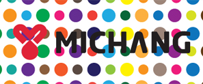
Located on a complex background.